A professional piece of design work or illustration has the following design qualities:
1.It's appealing.
2.It communicates the intended message clearly.
The simple tools we have at our disposal to achieve these simple goals are:
1.Value
2. Composition
3. Color
4. Shape
5. Line
Related rant:
If you took a design course in college that made you buy a giant $120 book and made you memorize a 1200 terms, just forget all that stuff for a moment and focus on the 5 core design elements I just mentioned. Academic systems have a way of overcomplicating things that are meant to be simple.
The people who make things the most complicated tend to be the academics who produce little to no work in their field and often fill the time that they could be making work making aoverly complex theories and texts that prevent others from having time to produce work....anyway...
We have 5 basic tools and those tools to achieve the goal of clear visual articulation. When these tools are used to set up a system which promotes clear Hierarchy and Communication this goal is possible.
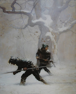
Lets look at value as an example of hierarchical structure in the works of Wyeth, Kramskoy, and Bouguereau. Please notice and start employing a similar pattern of hierarchy with line, color, composition and value in your own work.
The pattern is this: Big, medium, small (a shot of one, a pint of another, and gallon of the third).
We employ Hierarchy because we see it in nature and when we accurately emulate the patterns found in nature we will create harmony and appeal in our work. The natural world is the greatest gallery we will ever walk through and mother nature ought to be the muse of every artist. Appeal is only the begging though, we also need to create work which facilitates clear Communication: Art is a language and the sentences we string together ought to be articulate.
Communication: 5 design tools three core emotive messages.
Stability, Rest, Movement: What is the core message of your image? What is the secondary message? Is there a tertiary (third) message? For the sake of clear communication these 2-3 messages ought be set up in a clear visual hierarchy that aligns with their importance to your story.
As an example lets look at the following visual narrative of Catherine (kitty) Austin by Sargent.
The subject matter is of a young girl but the primary emotive message has an ironically serious tone. She looks like she'd be more at home overseeing corporate takeovers than playing hopscotch. What kind of hierarchical design is employed to achieve this?
(As a quick contrast here a 2 other Sargent paintings of little girls that have a very different emotional tone):
VALUE:
We connect dark values with rest. That rest can either be ordinary like the rest we associate with sleep or very serious like the rest we associate with the grave. A little girl with her eyes open who is surrounded by a dominate key/value of dark will elicit the second connection and make the work feel much more serious (even ominous) than a portrait of a happy little girl normally should be. Notice that area wise mid keys and high keys fall into a descending hierarchy.
COMPOSITION:


We connect upright shapes (like an upright figure or salt shaker) with the idea of stability. Painting Catherine with an extreme upright posture adds to the sense of seriousness already established by the dominant dark key of the painting.
COLOR:
The color pallet here is dominated by desaturated warms/reds. A design hierarchy which is dominated by low keys and reds will tend to feel emotionally dark even sinister. Another narrative element to give this portrait of a little girl a strangely sober tone.
SHAPE:
Typically the shape hierarchy for a child painting would go something like: ROUND(restful/safe),TRIANGLE (Movement/energy), Square (Stable/serious). Kids are first safe, then fun, and perhaps just a bit stable or serious. Here the formula is reversed by Sargent. The low key the child is bleeding into forms a serious dark box, the child is built of many sharp/dangerous angles and is only subordinately balanced by the round shape of her chin.
 The point of all this: A design hierarchy is your key communication point to a viewer. If you want to make a child appear happy and healthy: Safe, fun, childlike etc pick a design hierarchy which reflects/communicates that. If you want a child to appear as dangerous and serious as Claudia from interview with a vampire change up your design choices to reflect that.
Bonus: Here's another even more simple way to think of all the design/drawing and painting tools at an artists disposal:
LINE:
Draftsmanship/perspective, Anatomy, line weight and shape.
COLOR:
Light, Harmony, Expression.
VALUE:
Chiaroscuro (light and shadow=realism), and Notan (light and dark=design)
...and Notan her-->
Here's a pictorial/graphic breakdown of those elements:


