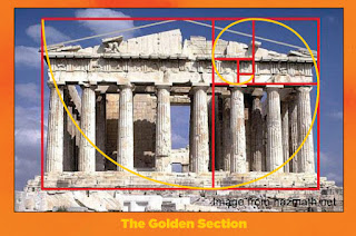
Our goal as an artist should be to set the elements of design (Value, Color, Composition, Line, and shape) in clear Hierarchies of primary, secondary, and tertiary visual weight. When we do so we are appealing to the design matrix already laid out for us in nature. Our work will thus feel integrated into the universe around us and be made more accessible and acceptable to the viewer.
A simple way to think of this hierarchy is to imagine your design elements laid out in terms of Big, Medium, and small in regards to their "visual weight".
http://www.sharefaith.com
Examples of Hierarchy in nature:
It's even in the frost on my car window. Once you're aware of these patterns they're hard not to see. Our universe is build on this beautiful stuff:


